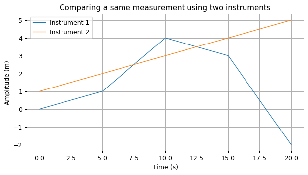
4.4. Title, axis labels, legend and grid#
We can add axis labels, a legend, a title and a grid using these functions:
plt.xlabel adds a label for the horizontal (x) axis;
plt.ylabel adds a label for the vertical (y) axis;
plt.legend adds a legend to identify the series;
plt.title adds a title to the graph;
plt.grid adds a grid to the background.
For example:
import matplotlib.pyplot as plt

x = [0.0, 5.0, 10.0, 15.0, 20.0]
y1 = [0.0, 1.0, 4.0, 3.0, -2.0]
y2 = [1.0, 2.0, 3.0, 4.0, 5.0]

# Plot the data
plt.plot(x, y1)
plt.plot(x, y2)

# Add axis labels
plt.xlabel("Time (s)")
plt.ylabel("Amplitude (m)")

# Add a legend (labels are in the same order as they have been plotted)
plt.legend(["Instrument 1", "Instrument 2"])

# Add a title
plt.title("Comparing a same measurement using two instruments")

# Add a grid
plt.grid(True);

Good practice: Legend labels
Another, less error-prone way to add legends is to define the labels at plot time. Instead of:
plt.plot(x, y1)
plt.plot(x, y2)
plt.legend(["Instrument 1", "Instrument 2"])
we may do:
plt.plot(x, y1, label="Instrument 1")
plt.plot(x, y2, label="Instrument 2")
plt.legend()
Both methods give the same results, but in the the second one, the legend always matches what is displayed on the figure, even if we modified the number of plt.plot calls and forgot to update the plt.legend call accordingly.
