4.6.4. Exercise: Plot styling#
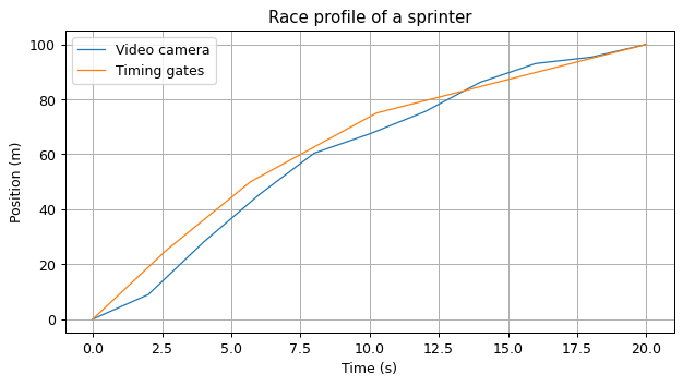
In Exercise: Plotting a series 2, using these data:
# Video camera data
t = [0.0, 2.0, 4.0, 6.0, 8.0, 10.0, 12.0, 14.0, 16.0, 18.0, 20.0]  # seconds
p = [0.0, 8.9, 28.0, 45.2, 60.4, 67.4, 75.5, 86.2, 93.0, 95.3, 100.0]  # metres

# Timing gates data (placed at positions 0m, 25m, 50m, 75m, and 100m)
timing_gates_time = [0.0, 2.65, 5.70, 10.25, 20.0]  # seconds
you generated the following figure:

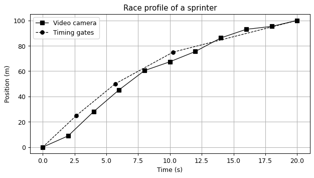
You now need to print it in black and white for publication in a journal. To maximize the clarity of the figure, you want to use markers and line styles instead of grey shades.
Generate the figure again, but this time with these specifications:
The video camera curve must be a solid black line with square markers.
The timing gates curve must be a dashed black line with round markers.
Show code cell content
import matplotlib.pyplot as plt

plt.plot(t, p, "s-k")
plt.plot(timing_gates_time, [0, 25, 50, 75, 100], "o--k")
plt.title("Race profile of a sprinter")
plt.xlabel("Time (s)")
plt.ylabel("Position (m)")
plt.legend(["Video camera", "Timing gates"])
plt.grid(True);

